MY AUCKLAND
MY AUCKLAND
MY AUCKLAND
MY AUCKLAND
An interactive map with glimpses into the people and places that make up Auckland.
An interactive map with glimpses into the people and places that make up Auckland.
An interactive map with glimpses into the people and places that make up Auckland.
An interactive map with glimpses into the people and places that make up Auckland.
Agency
Satellite
Client
Auckland Museum
Role
Senior interaction designer
Type
Exhibition - Touchscreen
BACKGROUND AND BRIEF:
Tāmaki Herenga Waka Stories of Auckland is a permanent exhibition at Auckland Museum, exploring the city’s rich history through multiple lenses. Artefacts, footage, installations and artworks bring to life the development of Tāmaki - from Māori settlement to colonial times to the diverse cultures that now call it home.
As part of the exhibit, Satellite was commissioned to film mini-documentaries featuring people from across Auckland, capturing their unique perspectives. My role was to design the interface that would showcase and present these stories in an engaging way.
APPROACH:
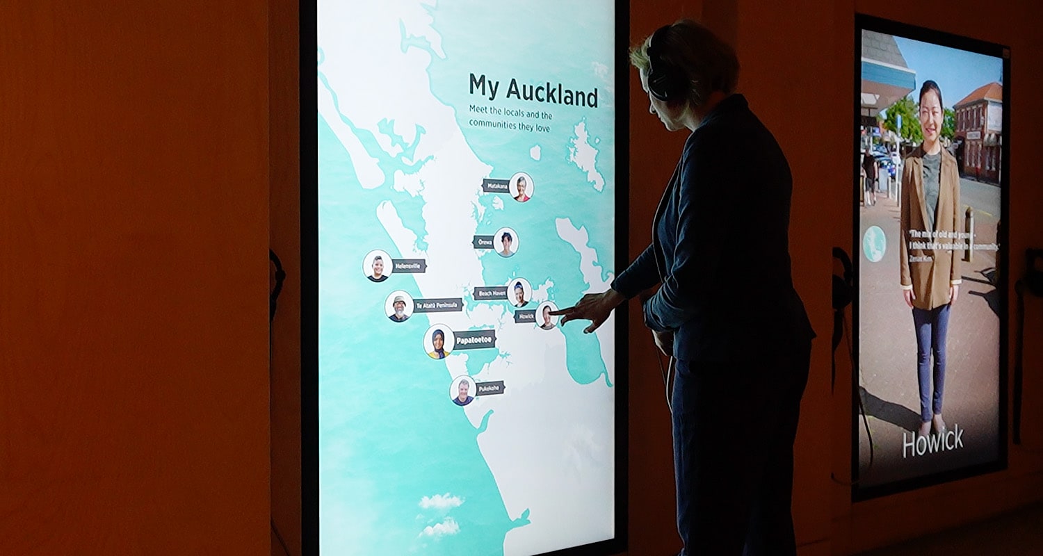
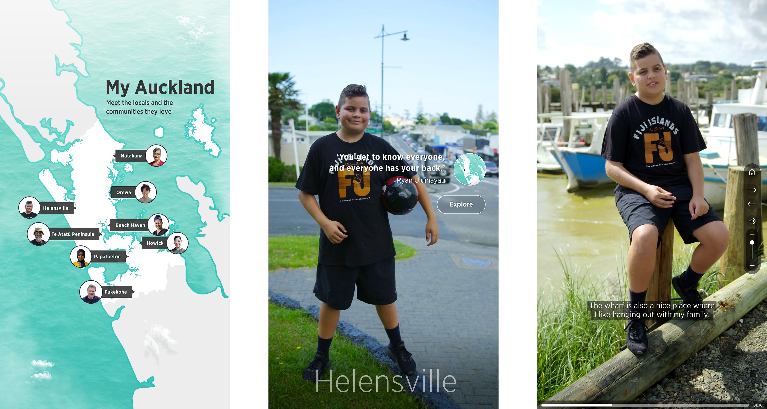
Two large, portrait-mounted screens were installed in the gallery which was an unusual but exciting format that allowed for a fresh approach to interface design. Auckland’s naturally long and narrow shape made a portrait layout a perfect fit for the interactive map, which served as the main navigation tool.
The videos were bold and visually compelling, so the interface needed to be clean and simple, letting the films take centre stage. I designed a high-contrast, graphic map with interactive points, giving visitors an intuitive way to explore different stories.
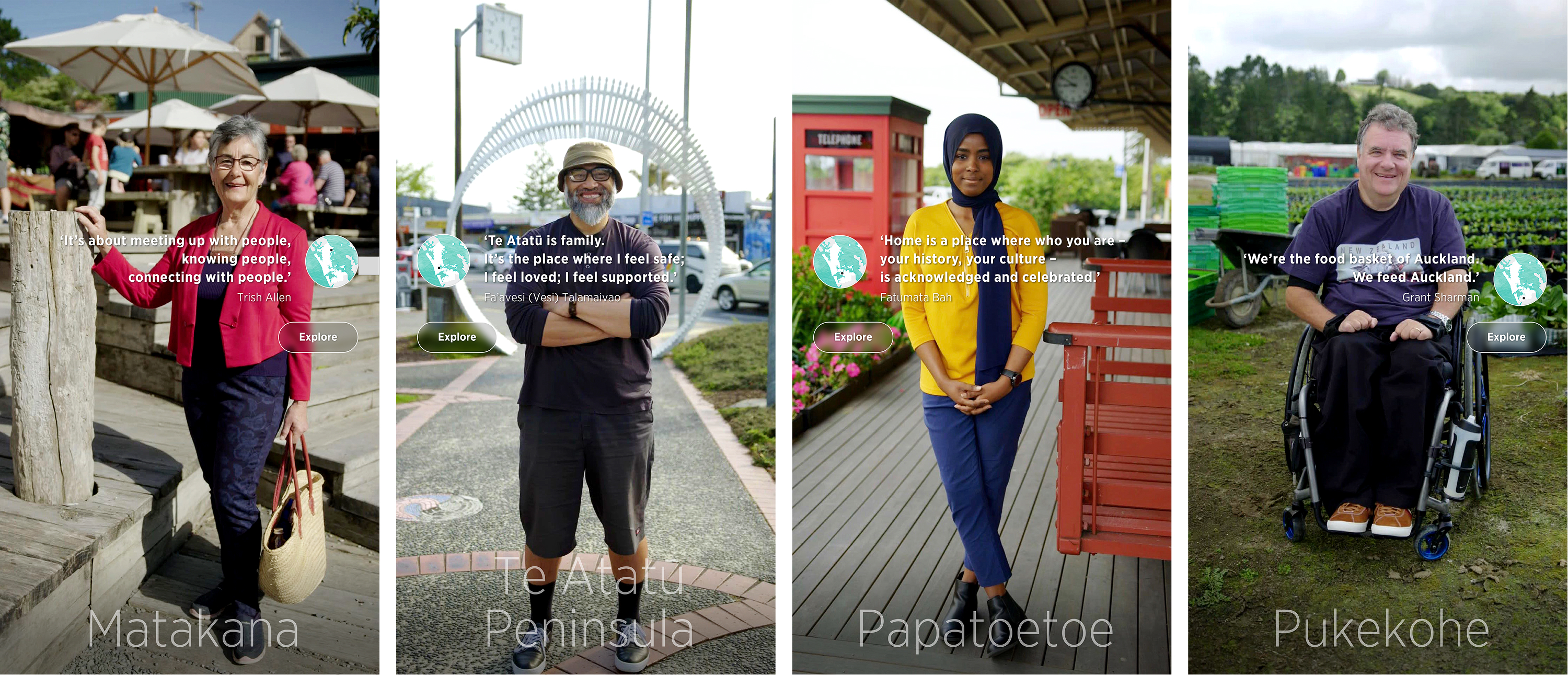
To add movement and draw visitors in, the screensaver featured short video clips of each person in a moment of stillness, overlaid with a quote from their interview. This created a dynamic effect that offered a glimpse into their personalities, stories and communities.
APPROACH:
Two large, portrait-mounted screens were installed in the gallery which was an unusual but exciting format that allowed for a fresh approach to interface design. Auckland’s naturally long and narrow shape made a portrait layout a perfect fit for the interactive map, which served as the main navigation tool.
The videos were bold and visually compelling, so the interface needed to be clean and simple, letting the films take centre stage. I designed a high-contrast, graphic map with interactive points, giving visitors an intuitive way to explore different stories.
To add movement and draw visitors in, the screensaver featured short video clips of each person in a moment of stillness, overlaid with a quote from their interview. This created a dynamic effect that offered a glimpse into their personalities, stories and communities.
SCREENSAVER AND CONTENT IMAGES
SCREENSAVER IMAGES
CHALLENGES:
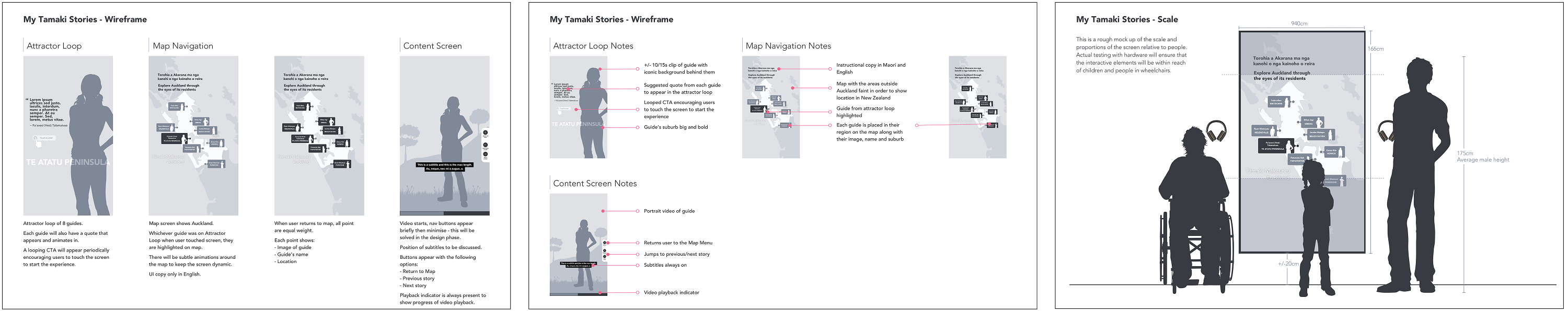
Working in a large portrait format was a shift from the usual landscape layouts, but it was a great opportunity to do something different. Another key challenge was ensuring the menu placement worked for all visitors, including those using wheelchairs or shorter visitors.
CHALLENGES:
Once of the biggest updates and improvements to the table was the installation of a large optical touch-frame. This now offered the benefit of turning the entire table into a touch surface. The disadvantage of this was, if visitors leaned on the table, this would be read as a trigger point. Eventually users would understand how to navigate and adapt their behaviour to the touch surface.
CHALLENGES:
Working in a large portrait format was a shift from the usual landscape layouts, but it was a great opportunity to do something different. Another key challenge was ensuring the menu placement worked for all visitors, including those using wheelchairs or shorter visitors.
RESULT:
A striking and bold display with an interface that allows the film content to shine while complementing and augmenting it with quotes, details, and intuitive navigation. The screensaver animates through featured short video clips of each person, posing casually and overlaid with a quote from their interview. The subtle motion draws people in and encourages them to learn more about the people that make up Tāmaki.
VARIOUS SCREENSAVER IMAGES
SCREENSAVER IMAGES
INTERACTION DESIGN PLANNING PROCESS
INTERACTION DESIGN PLANNING PROCESS
WIREFRAME AND PLANNING
The images below show the wireframe process and consideration given to enable accessibility to the menu for shorter people or people in wheelchairs.
When I began to design the visual identity of the exhibition, my starting point was to draw inspiration from the rocks. Their physical makeup is faceted which offered a certain pleasing design aesthetic plus there is a multitude of colourful stones embedded within them.
The content was very text-heavy so I knew I needed to design a neat grid structure for the various templates. The templates needed to be scalable and to work across all the banner wall sizes. The treatment for the banner wall titles was also important as they needed to indicate the section and rock type and act as visual markers. Defining templates upfront helped to define a word count for each of the banners, which then helped the content editor shorten the text to fit the templates.
The images below show the wireframe process and consideration given to enable accessibility to the menu for shorter people or people in wheelchairs.